Marsden Font Family

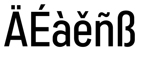
Marsden is a bold, no-nonsense Grotesque. It was designed for display, branding, advertising, packaging or anywhere a strong voice is needed. Marsden is built on a geometric foundation, with just enough warmth to keep the style confident and lively. The family features 8 widths in 12 weights; from a Slim Hairline to an extremely bold Wide Super. The fonts flow from condensed to wide with design intent. The condensed forms feature flat sides and subtle curves, while the wider forms feature rounded sides and open curves. The character set is robust, covering extended latin. The default forms are contemporary with alternates including: single-story a, two-story g, curved terminal l, raised vertex M, rounded top A, fully rounded G, rounded leg R, straight tail Q and straight descender y, all separated into individual style sets for control and customization. Completing the family are the Text fonts where the weights, widths and spacing are adjusted for smaller use.

Marsden Slim Black —
HAND BUILT

Subfamily

Style

Size

Marsden Black —
2 TURNTABLES

Subfamily

Style

Size

Marsden Slim Thin —
Backspin Technique

Subfamily

Style

Size

Marsden Compressed Bold —
BREAK BEAT

Subfamily

Style

Size

Marsden Condensed Regular —
PUNCH PHRASING

Subfamily

Style

Size

In-Use

Marsden font by J Foundry — the word “STEREO” in various sans-serif styles, weights, and widths, with additional text like “STEREOPHONIC LIVE SOUND” and “FULL STEREO” on horizontal bands of different colors, along with arrows and dots.
Marsden font by J Foundry — the words “THELONIOUS” in large black sans-serif letters, “MONK” in large white sans-serif letters, and smaller text “genius of modern music” and “Album cover designed by Reid Miles in 1956”
Marsden font by J Foundry — a music festival lineup with the words “PITCHFORK MUSIC FESTIVAL JULY 17-19 UNION PARK CHICAGO” in yellow sans-serif, and a list of artists in white sans-serif, with the top three lines in a larger, bolder weight.
Marsden font by J Foundry — a collage of posters with sans serif lettering, including “RECORD STORE DAY,” “VINYL RELEASES,” and “SUPPORT YOUR LOCAL RECORD STORE” in concentric circles.

Extra Compressed Slim width

Super bold weights
Alternate A
Alternate G, M
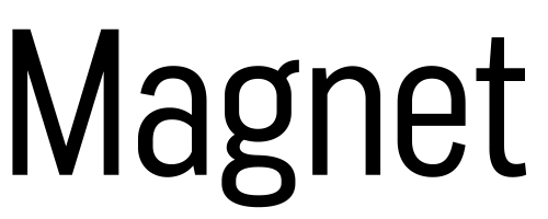
Alternate g
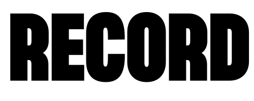
Alternate R
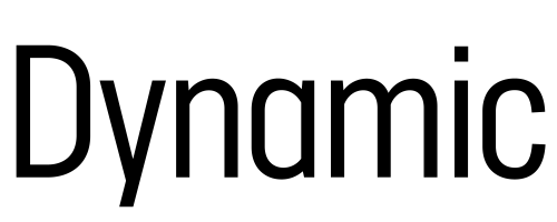
Alternate y, a
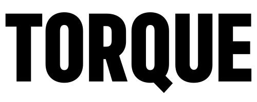
Alternate Q
Language support
Fractions