Sundry Font Family

Sundry is J Foundry’s take on the early 20th century grotesque. The design draws influence from various designs of the period. Drawn and cut by hand, these sans have idiosyncrasies and quirks, producing a warm friendly look. The design objective was to even out the quirks and add consistency, without losing the warmth. Sundry looks to balance character and structure for a clear but personable read.

Sundry Condensed Super Black —
POST NO BILLS

Subfamily

Style

Size

Sundry Medium —
Sundry Grotesque

Subfamily

Style

Size

Sundry Regular —
42 fonts in 3 widths, starting at $149

Subfamily

Style

Size

Sundry Super Black —
BILLBOARD

Subfamily

Style

Size

Sundry Narrow Heavy —
Public Notice

Subfamily

Style

Size

Sundry Bold —
Telecasting

Subfamily

Style

Size

Sundry Medium Italic —
Gröteşqûély

Subfamily

Style

Size

Sundry Light —
The Collective

Subfamily

Style

Size

Sundry Condensed Thin —
Straightforwardness

Subfamily

Style

Size

Sundry Regular —
September 18-24

Subfamily

Style

Size

Sundry Bold —
seven weights × three widths + italics

Subfamily

Style

Size

Sundry Regular Italic —
“Printers favour grotesques because of their greater durability: there are no serifs to be bruised or hairlines to gap” - Stephenson Blake & Co. 1910

Subfamily

Style

Size

Sundry Variable —
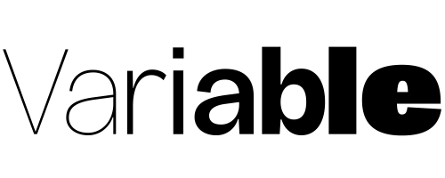
Variable Fonts

Subfamily

Style

Size

Sundry Variable Italic —
Sundry Variable contains all weights and widths in a single file. (Roman and Italic are separate).

Subfamily

Style

Size

Sundry Variable —
Weight & Width

Subfamily

Style

Size

In-Use

Sundry font by J Foundry — the words “Sundry — 42 classic grotesque fonts from JFoundry.” in an upright sans serif.
Sundry font by J Foundry — four posters showing large sans serif letters and words, including “SGGS”, “POSTERS FAVOR THE GROTESQUES because of their greater simplicity and readability in various weights”, the number “4”, a list of italic weights, and “Condensed.”
Sundry font by J Foundry — a large white sans serif letter C on a red background, with the words “close your aperture” in white sans serif text to its right
Sundry font by J Foundry — the letters R, R, ampersand, and R in sans serif, with “THREE WIDTHS” written vertically on the left and right sides
Sundry font by J Foundry — three rows of sans serif lowercase letters “a” in varying weights and widths, with text “7 weights × 3 widths + Variable Version”
Sundry font by J Foundry — four posters showing sans serif letters and numbers: the letters S and G filled with a black and white building photo, black and white lowercase a and g, green and white numbers 3, 4, 5, 6, 7, and 8, and the word “grotesque” repeated in white and outline forms
Sundry font by J Foundry — the word “VARIABLE” repeated four times in sans-serif capitals, alternating between a very thin outline and a bold fill, with the words “VARIABLE VERSION” and “INCLUDED IN THE FAMILY PACK” in thin sans-serif capitals along the left and right edges
Sundry font by J Foundry — the word “grotesque” shown as a blue outline of bezier curves and control points on a blue background
Sundry font by J Foundry — three columns of sans serif italic text, each showing the words “Thin Italic”, “Light Italic”, “Regular Italic”, “Medium Italic”, “Bold Italic”, “Heavy Italic”, and “Super Italic” in progressively heavier weights

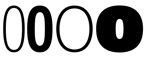
Variable version

Closed apertures

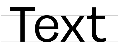
Large x-height
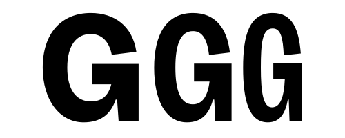
Three widths
Consistently rounded forms
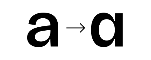
Alt a
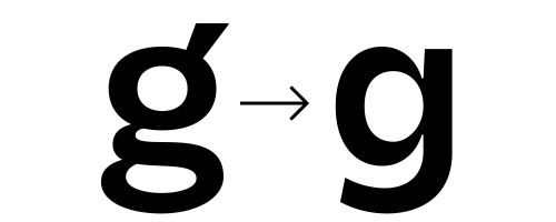
Alt g
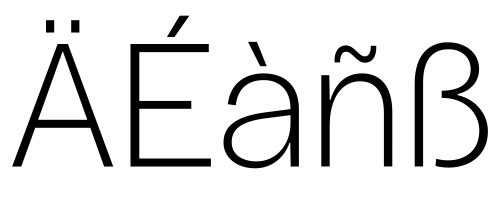
Language support

Character Set
A Á Â Ä À Ą Å Ǻ Ã Ă Æ Ǽ B C Ć Ç Č D Ď E É Ê Ë È Ę Ě F G Ğ H I Í Î Ï İ Ì J K L Ł M N Ń Ñ Ň O Ó Ô Ö Ò Ø Ǿ Õ Ő Œ P Q R Ř S Ś Š Ş Ș T Ț Ť U Ú Û Ü Ù Ű Ů V W X Y Ý Ÿ Z Ź Ž Ż a á â ä à ą å ǻ ã ă æ ǽ b c ć ç č d ď e é ê ë è ę ě f g ğ h i ı í î ï ì j k l ł m n ń ñ ň o ó ô ö ò ø ǿ õ ő œ p q r ř s ś š ş ș ß t ț ť u ú û ü ù ű ů v w x y ý ÿ z ź ž ż ª º 0 1 2 3 4 5 6 7 8 9 . , : ; . . . ! ¡ ? ¿ · • * # / \ ¡ ¿ - – — _ ( ) { } [ ] ‚ „ “ ” ‘ ’ « » ‹ › " ' @ & ¶ § © ® ™ ° | † ‡ ¢ $ € £ ¥ + − × ÷ = > <